Having a brand style board for your blog that defines your visual identity has now become an essential part of blogging, In this post I'm going to show you how to create your own brand board for your blog or business. But first let's look at what a brand style board is and why you want to have one.
What is a brand board?
A brand board, or brand style board is simple a one page document that summarises all the elements of your brands visual identity from your colour palette, fonts and image style. It differs from a brand style guide which is a more detailed document that goes into detail about where and how the various elements of your brand identity are to be used.
Why is it important?
A brand board is an important part of your blog especially if you want to be taken seriously, look professional and build up your following because it quickly and easily defines your brand style.
Defining your visual identity and having it all together in one place makes it easier for you to keep your blog and brand visuals consistent which is key to looking professional, building trust with your audience and growing your blog.
It also makes designing your website, blog post feature image, content upgrades, social media images etc. easier and quicker as you already know the colours, fonts and general style of your design.
Basically a brand board is important for your blog or business because it clearly sets out your brand style so that you can ensure your brand visuals are consistent which helps make you look like a pro and build trust with your audience.
O.K, so now that you know why a brand board is so important. let's look at what you need to include on your brand board. To help you I've also created a free brand board template so you can quickly and easily create your own board.

What you need on your brand board
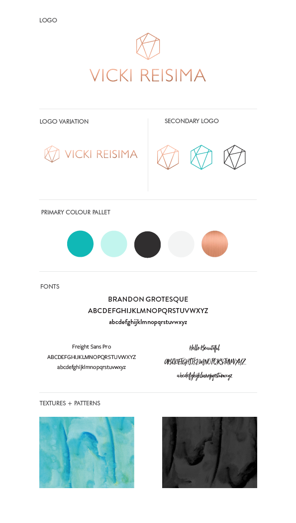
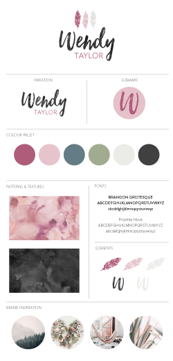
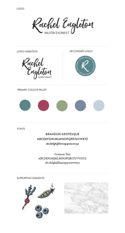
Logos
The main part of your brand identity is your logo. Your logo is a graphic or symbol used to promote and identify your brand. It is going to be the most identifiable aspect of your visual identity.
A brand often has a few different logos, all of which are included on your brand board.
Primary logo: this is the main logo of your brand and is the logo that you will use at the top of your website and on most other brand graphics and items.
Variation: this will be a variation of your main logo and is typically a different layout or orientation to the primary logo. For example if your primary logo is all on one line then your variation might be a stacked layout. Your logo variation is to be used in circumstances where the orientation and/or dimensions of your primary logo doesn't work as well.
Submark: a submark is smaller icon or graphic that is used in situations where your primary or variation logo is too big. Think website favicons and profile pics.

Colours
Your brand colours are a central part of your brand identity. When used consistently across your brand media they will become synonymous with your brand and people will start to be able to identify your brand before they even see a logo.
There are no hard and fast rules for choosing a colour pallet but the following breakdown is a good guide to ensure you include all the colours you need in your pallett.
- 1 primary colour associated with your brand
- 1 primary action colour for buttons, links and calls to action
- 1 dark secondary colour for text, backgrounds etc
- 1 light secondary colour for text, backgrounds etc
- 3-4 accent colours to break up the primary colour scheme and/or highlight something special. These will be used mostly on your website and blog post images.
Don't be afraid to deviate from this breakdown if you don't want to have that many colours. You may be able to use some of your colours for more than one purpose. This is what I did with my brand colours.

Fonts
The next thing you need to do is choose your brand fonts. You don't want anymore than 2-3 fonts.
- One heading font
- One body font
- One accent font (optional)
When choosing fonts you want to make sure that the heading font and the body font contrast so you can tell the difference between the headings and the body. So for headings you might choose a bold font and for the body a lighter font. Having one serif and one sans serif font in your brand fonts is also an easy way to create contrast. To give you an example below are my brand fonts.

Textures & Patterns
Textures and patterns are not an essential part of your brand board but I think they add further dimension to your brand visuals. Typically, textures and patterns are used for backgrounds in brand graphics or on your website.
When it comes to choosing textures and patterns I think less is more. Often subtle textures and simple patterns are the most effective. You also want to make sure that the pattern or texture fits in with your brand colour pallet and helps capture the overall look and feel of your brand. For example if your brand is very feminine and classic, you wouldn't choose an industrial metal texture.

Elements & Illustrations
Supporting elements and illustrations are often used on your website and in blog post images. It's important to include supporting elements and illustration style on your brand board to keep things consistent and on brand.
Supporting elements may be small icons from parts of your logo, illustrations, swooshes and flourishes that may be used throughout your brand graphics, website, business cards, stationary and social media banner images to add interest to the overall design and help make your brand identity recogniseable.
Illustrations or icons can also be used on your website depict a specific thing, for example an illustration of an plate, knife and fork might depict the recipe section of your blog. It is therefore important that you define your illustration style so that when you need to create more for a new feature on your blog you can keep the design consistent.

Brand Inspiration
The final thing to include on your brand board is a few images that inspired the visual identity of your brand and captures the look and feel of your brand. This helps set the tone of your brand and also sets the style of imagery to be used on your blog.
Having a style for your photos is another way of keeping your branding consistent. Apple is a really good example of a brand that has a very strong image style. Their photos are always minimal, with their products as the central part of the picture against a plain white background.
AND VOILA!
Once you've pulled all these pieces together into one document your brand board should look a little something like this.

If you want to create a brand board like this for your blog or business then make sure you download the free brand board template. I have created templates in Adobe Illustrator, PDF and PNG files so that you can create your brand board in your program of choice.
If you have any questions or want to share your brand board, post in the comments below.